
Welcome to Data Bytes, where we share data insights from our ongoing research. This week’s visuals are courtesy of our summer intern Tanisee Nagaldinne and Dr. Ensari, and is from the CPP Tracker study.
If you have been a part of our ongoing CPP Tracker study, you likely noticed one of the weekly surveys called “Pain Self-Efficacy”[1] in the ehive app. If you have wondered about this survey, this post is for you! Today, we will explore how pain levels relate to this term called “self-efficacy” by looking at some boxplots using the ehive data.
Understanding the Basics
Before we jump in, let’s quickly define some key terms:
- Self-efficacy: This is your belief in your ability to accomplish tasks or handle challenges. In the context of pain, it’s about how confident you feel in managing your daily activities despite the pain-related discomfort.
- Boxplot: This type of data plot looks like a rectangle box with whiskers on each side, therefore also called a “box and whiskers” plot. The “box” shows where most of the data points fall, with lines (or “whiskers”) extending to show the full range. It’s a great way to see how spread out or bunched together the weekly survey responses are.
Let’s look at the figure below. It shows 3 boxplots depicting how weekly pain self-efficacy scores relate to different levels of pain symptoms (none, low, moderate, severe intensity).
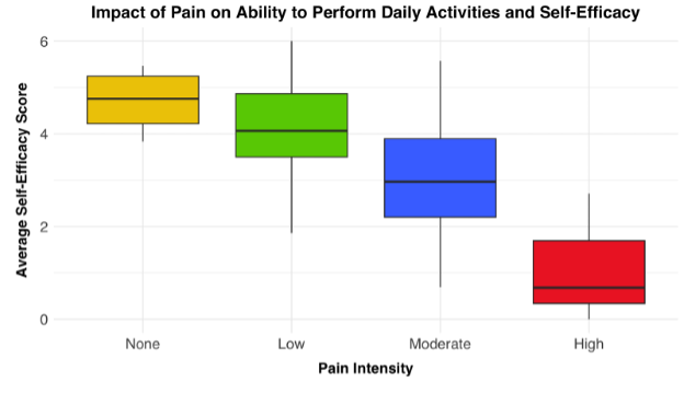
What The Data Show
Overall, this plot reveals a clear trend: as pain intensity increases, self-efficacy tends to decrease. Here’s what we see looking at the “boxes”:
- People reporting no or low (yellow and green) have the highest self-efficacy scores for that week.
- Weeks with moderate-intensity pain (blue) are associated with a noticeable dip in self-efficacy.
- High pain intensity (red) is associated with significantly lower self-efficacy scores for that given week.
How about the “whiskers”? What do they tell us about the distribution of self-efficacy scores within each pain category? Some interesting observations:
- The “no pain” group has the tightest cluster of scores, suggesting more consistent self-efficacy levels.
- Moderate intensity pain has the largest variability, indicating more varied experiences of self-efficacy during these weeks.
- Weeks with low-intensity pain are similar to the weeks with moderate-intensity pain in terms of variability, though to a lesser extent.
- Distribution of the self-efficacy scores when the pain is high intensity is similar to the “no pain” category. Some individuals maintain relatively high scores during these weeks, shown by the upper whiskers reaching into higher ranges.
What Does This Mean for You?
These findings highlight the complex relationship between pain and our belief in our abilities. While increased pain often correlates with lower self-efficacy, it’s not a one-size-fits-all situation. Some people maintain impressive resilience even in the face of significant discomfort.
Interesting Tidbits
- Did you know that self-efficacy isn’t just about pain? Research suggests it can influence everything from academic performance to health behaviors[2].
- The concept of self-efficacy was introduced by psychologist Albert Bandura in 1977. He believed that people’s beliefs about their capabilities are often better predictors of behavior than their actual abilities[3].
Moving Forward
Understanding the link between your pain levels and self-efficacy can be a powerful tool in your health journey. If you notice your confidence dipping as pain increases, remember that you’re not alone. Remember that self-efficacy is a modifiable factor, i.e., there are various strategies to boost your level of self-efficacy.
We’re continually amazed by the insights you all provide through the ehive app. Thank you for being a part of CPP Tracker and contributing to this important research! What’s your experience with pain and self-efficacy? Does it align with these findings?
This Data Byte is part of the CPP Tracker study.