
Welcome to Data Bytes, where we share data insights from our ongoing research. This week’s visuals are courtesy of Dr. Ensari, and is from the CPP Tracker study.
Happy holiday season dear CPP Trackers! This month, we come to you with two new plots visualizing a questionnaire you have likely seen numerous times in your ehive App: the EuroQoL-5D.
First things first. What is the EuroQoL-5D?
The EuroQoL-5D (EQ-5D) is a self-report questionnaire that helps researchers and clinicians measure health-related quality of life (QoL). It is akin to a health report card that looks at five key areas of daily living: mobility, self-care, usual activities, pain/discomfort, and anxiety/depression. For each area, people rate their problems from “no problem” to “extreme problem.”
Reading the Bubble Plot
The bubble plot shown tells an interesting story about our study participants. Here’s how to read it:
- The y-axis (vertical) shows anxiety levels from “not anxious” to “extremely anxious”
- The x-axis (horizontal) shows problem levels for other health domains from “no problem” to “extreme problem”
- Different colored bubbles represent different aspects of health, which are mobility, pain/discomfort, self-care, and usual activities
- The size of each bubble shows how many patients gave that particular combination of responses
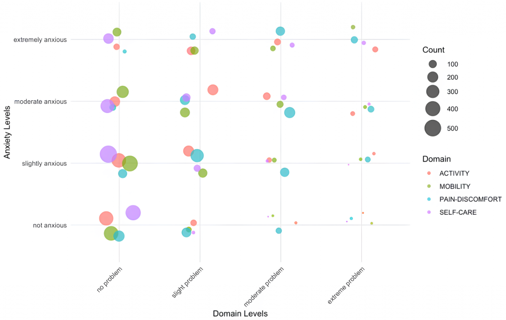
Key Findings
- Clustering Patterns
The largest bubbles appear in the “no problem” to “slight problem” range across domains, indicating that many patients report mild to no issues in multiple areas simultaneously. However, there’s more variation in anxiety levels even among these patients, based on the more similarly sized bubbles of different colors distributed across the 1st column (i.e. corresponding to “no problem” on the x-axis). - Severity Correlations
A notable trend shows that as problems become more severe in any domain (moving right on the x-axis), anxiety levels tend to increase (moving up on the y-axis). This pattern is particularly evident for the pain-discomfort domain. There’s a notable relationship between pain/discomfort (blue bubbles) and anxiety levels. As pain problems increase, we see more patients reporting moderate to extreme anxiety. - Daily Activities Impact
The purple bubbles (usual activities, such as work, study, housework, family or leisure activities) show a similar pattern – as difficulty with usual activities increases, anxiety levels tend to rise as well.
Here is another way to “slice” these data:
This time, we are visualizing the same data separated by each of the 4 domains using a ridge plot. The x-axis shows another question from the EuroQoL, which is “Rate your health today” and is rated on a visual analog scale (VAS) of 0-100, where higher scores indicate higher overall health.
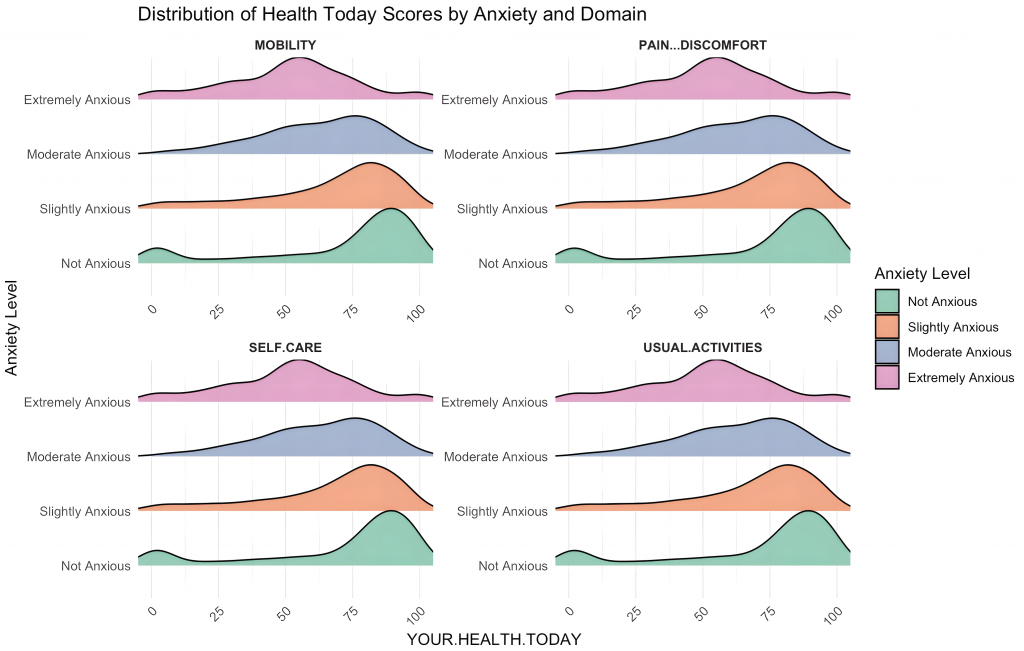
How to interpret the distribution plot:
The y-axis (vertical) shows the frequency of each response option for all 4 domains. The x-axis (horizontal) shows the ratings on the overall health VAS question. Think of these curves like mountains showing how people rate their health. The further right the “mountain peak,” the better people feel about their overall health.
Here’s what we’re seeing:
Those who report being “Not Anxious” tend to have their mountain peaks toward the right side of the graph – meaning they generally feel better about their health (i.e., scores closer to 100). As we move up to people who feel more anxious, these mountains shift toward the left and the distributions become more even, showing that anxiety often goes hand-in-hand with more health challenges.
Putting it all together
What does this all mean? And why do we care about these patterns? For several reasons. First, they indicate that physical health challenges and emotional well-being are closely connected, especially for those living with chronic pelvic pains conditions. This suggests that maintaining normal daily routines plays a crucial role in emotional health. Self-care support might be particularly effective as patients seem to maintain this ability better than other functions. Supporting patients’ ability to maintain daily activities might help reduce anxiety levels.
From an application perspective, these collectively suggest that a comprehensive treatment approach that addresses both physical and emotional aspects may be most effective. Similarly, managing anxiety might be important to consider alongside treating physical symptoms. Questionnaires like the EuroQoL that are easy to administer and have been benchmarked are therefore useful to quickly get a sense of an individual’s overall wellbeing. This then can help with timely intervention to prevent further escalation in any domains.
These data remind us that chronic pelvic pain isn’t just about physical discomfort – it’s about how it affects every aspect of a person’s life, from doing daily tasks to emotional well-being. Understanding these connections helps researchers elucidate the dynamic nature of CPPDs and healthcare providers to deliver better, more complete care.
And this is it for our last post of the year. What do you think? Do these findings resonate with your experiences? What other patterns do you notice in these data visuals? We wish you a fantastic holiday season and happy new year!
This Data Byte is part of the CPP Tracker study.