
Welcome to Data Bytes, where we share data insights from our ongoing research. This week’s visuals are courtesy of our in-house data analyst Samia Shahnawaz from the CPP Tracker study.
Ever wondered when most people hit the hay or rise and shine? This week, we are sharing insights from the ongoing CPP Tracker study. The circular plot reveals the average sleep and wake times of our study participants, making it easy to spot trends.
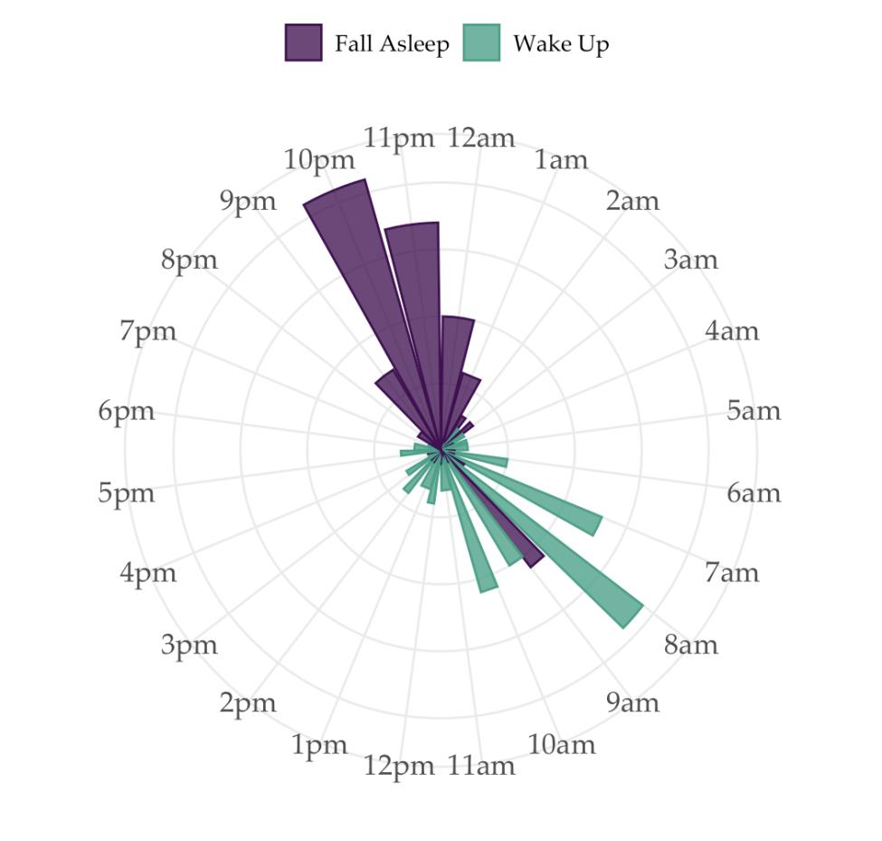
Purple Bars: Represent bedtimes. Longer bars mean more people go to bed at that time. You’ll see that most folks nod off between 10 PM and 1 AM.
Teal Bars: Show wake-up times. Longer bars indicate more people wake up at that hour. The majority greet the day between 6 AM and 8 AM.
This colorful visualization offers a fascinating glimpse into our collective sleep habits. Interested to see more insights like this? Stay tuned for more posts with data visuals and insights in the coming weeks.
Sweet dreams and good mornings, everyone!
![]()
This Data Byte is part of the CPP Tracker study.